AutoMelta data analyses walk through.
Program remit
Aim: This program was developed for the rapid
analysis of LightScanner mutation scanning data. The aim was for any
non-homozygous wild type genotypes to be detected with the minimum of user
interaction and selected for further analysis.
Error rate: As with all mutation detection methods,
it is expected that the program will not be able to successfully analyse all
DNA targets for all known genotypes. However, it is anticipated that it will
have a false negative rate of less than 2% for templates that are analysable.
Presence of SNPs: It is expected that PCR amplicons
harbouring common SNPs will not be used. The presence of high-frequency
sequence variants of this type considerably complicates and limits the
automated identification of rare, potentially pathogenic variants. Where
targets contain rare SNP variants, they will be identified and analysed in the
same way as disease-causing mutations, and are considered as such in any
measure of the program’s sensitivity and specificity.
Sample set composition: Ordinarily, as implied by
the previous paragraph, it is assumed that when run with minimal user
interaction, most samples will have the same wildtype genotype. However, at the
price of increased user interaction, samples sets with fewer samples and/or
similar numbers of mutant and wildtype genotypes can be analysed.
Assay development: It is expected that the initial
assay development should consist of three stages:
1. Develop a reliable PCR assay for the target sequence that is not prone to the
amplification of primer dimers or non-target DNA sequence.
2.Perform initial analysis of the fluorescence/temperature data to verify that the curve
can be successfully analysed.
3.Describe the optimum parameters to use when analysing the data in the
unattended/user-free mode.
Data files
The Idaho TechnologyLightScanner® instrument produces various
data files (Table 1); of these only one of the fluorescence data files
is needed (.mlt or .unc) by AutoMelta. All except the .tif
(image) and .mat (binary) files consist of tab-delimited text. As data
is collected, it is appended to the appropriate file, so that the first line of
each file is represents the earliest reading. If a .tem file is not
supplied, the program will generate a temperature array which will be used in
the analysis and display of the fluorescence data. Temperature readings are
taken at discrete timepoints and the assumption is made that each well has the
same temperature. However, analysis of actual data suggests that this is not in
fact the case, and the temperature reading should be considered only to be
semi-quantitative. A corollary is that the use of artificial temperature arrays
does not affect the final analysis. Similarly, the final result is not affected
by the choice of either the .mlt or the .unc file as data source.
| File suffix |
Information |
| .mat |
File containing an 8-byte binary array. |
| .tif |
Picture file containing an image of the micro-titre
plate as seen from above. |
| .bkg |
Unknown |
| .tem |
Single column containing plate temperature data. |
| .img alt='figure' |
1st column- Time and date stamp of the
reading.
4th column- Temperature data (repeat of .tem file).
5th column- Correction factor between the .mlt and .unc files. |
| .mlt |
96 columns; each column contains the data for a single
well. Columns 1, 2 and 96 contain data for wells A1, A2 and H12,
respectively. |
| .unc |
Duplicate of the .mlt file format. The data in
each row differs from the value in the .mlt file by MLT value = UNC
value – IMG correction factor. |
Table 1 Data files created by the LightScanner<.
Entering fluorescence data
The data file is
selected via the option of the
menu (Figure 1); this allows the selection of either an .unc or .mlt
file. The program then searches for a .tem file with the same name and
path as the fluorescence data file. If a .tem file is found, a message
box is displayed asking if you want to use the file; if you do not accept this
file or no file is found, then a second dialogue box is displayed, allowing you
select a pre-existing .tem file. If you click Cancel
, or if the .tem and fluorescence files do not contain the same number of data
points, the program will self-generate a temperature array.
Figure 1>AutoMelta analysis program.
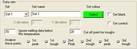
Selecting data sets
Once the melting
curve data have been entered, the samples must be grouped into sets; this is
done using the Plate setup window (Figure 2),
which is displayed by clicking the option on the menu. The set
properties are used by the program when analysing the data; the optional
features will be discussed in the data analysis sections, while the basic setup
procedure is described below.
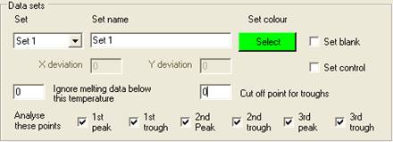
Setting the properties of a Set
Each set is
selected using the Set
dropdown list, and can be named by entering text under Set Name. Initially, the
default set colour is the same as the Windows background colour; to change
this, click the Select
button below the Set colour
label. One of 48 different colours can then be assigned to the set, and is used
to identify those wells and data curves that belong to the set. Each set can
contain a single blank well and/or a set of control samples, in addition to the
wells containing the samples to be screened.
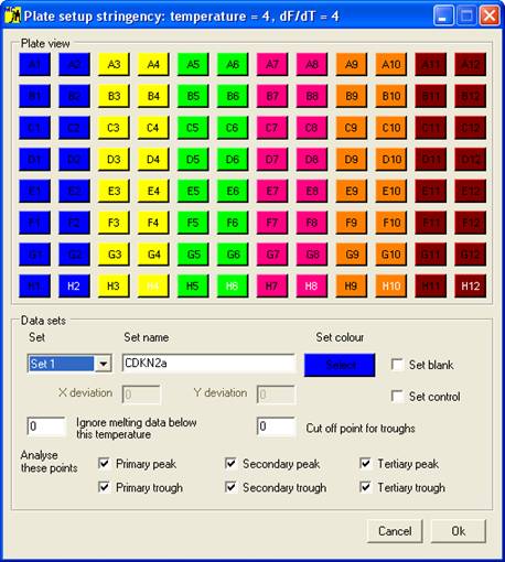
Figure 2 Plate setup window.
Adding wells to a set
Clicking the appropriate “well” on the 12x8 array adds
that well to the active set, and its button takes the set colour. (To deselect
a well, either click the button a second time or add the well to a different
set.) The order in which the wells are added to the set is stored and used when
the results have to be ordered in output files or when melting curves are
drawn. (Entering the shortcut “R” or “C” from the keyboard when a well has
focus will add all other wells in that row or column, respectively, to the
current set.)
Adding a blank to a set
Blanks are added
to a set in the same way as data wells, except that the Set blank check box must first be ticked. (The blank wells are
identified by the white text on their buttons.) Clicking on a blank button
converts the well to a normal data well. Since only one blank per set is
allowed, selecting a second well as a blank removes the first blank well from
the set. Sets do not require blanks for data analysis.
Adding control wells to a set
A set can
contain no controls, one control or a number of controls of the same genotype.
Adding a control is done in the same way as adding a blank, except that the Set control check box is ticked. Also, when
Set control is ticked, the X deviation and
Y deviation text boxes are enabled. The function of
these values will be described in the data analysis sections. Clicking a well
that has already been assigned as a control removes that sample from the set.
Saving the plate setup and viewing the fluorescence data
To accept the plate setup, select
the OK button, which will close the
Plate setup window. If melting curve data have been entered, the program
will now prompt the user to reanalyse the melting curve data (Figure 3).
If the data consist of more than one set, the first set will be displayed;
other sets can either be scrolled through sequentially with the mouse
scrollwheel, or selected from the dropdown list at the bottom of the window.
Plate setup information can be saved to a text file via the and options of the
menu. Once saved this file can be re-entered, allowing one setup file to be used for
multiple .unc/.mlt files. To discard the plate setup press the Cancel button.
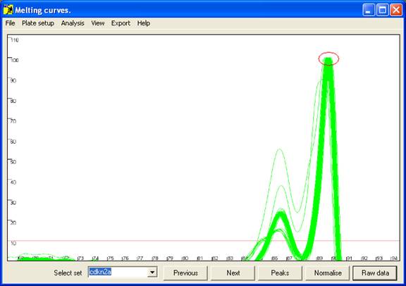
Figure 3: Graphical display of melting curve data. The red
circle indicates the normalised peak height, set to 100 units.
Viewing the data
The data undergo
two processes of transformation. The first step converts each initial melting
curve (fluorescence, F vs. temperature, T) to its approximate first
differential; i.e. the new curve plots the decrease in fluorescence per
unit of temperature (-dF/dT) vs. temperature. The second step normalises
the data and picks maximum and minimum points on the curve (referred to as data
points). These data points are then used by the program to determine the samples’
genotypes.
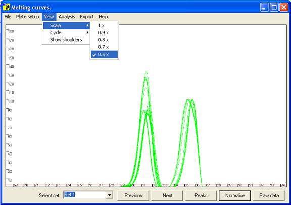
Figure 4 The axis scale can be adjusted via the option.
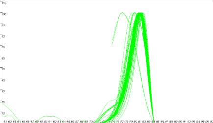
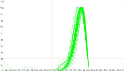
Initially the data are drawn in a partially normalised manner (Figure 3)
with the height of the final peak fixed at 100. (For most DNA fragments, this
last peak is the largest, but when this is not the case the scale can be adjusted
via the option of the menu (Figure 4).) These curves are not yet
normalised relative to the temperature axis, and show the intra-assay variation;
thus in Figure 3, all 92 samples lay within 0.25°
C of the average value. This view can be reproduced by pressing the Raw data button (bottom right of the interface).
To view the
normalised data, click the Normalise
button (Figure 5). This translocates the curves along the temperature
axis such that all the curves have a common end point (red ellipse in Figure
5). This view enables subtle differences between the curves to be seen.
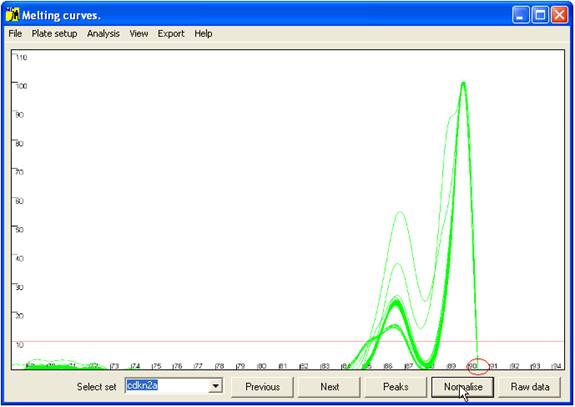
Figure 5: Graphic display of the normalised melting curve data.
The red circle indicates the point at which each curve has been standardised
for temperature.
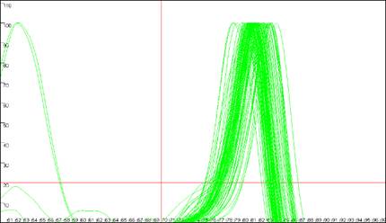
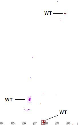
Rather than
comparing all points along the curve, only the positions of maxima (peaks) and
minima (troughs) are compared; these points are revealed (and the curves
hidden) by the Peaks button (Figure 6). At
each minimum or maximum, the points corresponding to the individual samples are
grouped into clusters. For each individual sample, the relationship between its
data point and the cluster is the basis on which genotype assignment is performed.
The Raw data, Normalise
and Peaks views can also be accessed while the cursor
is in the graph area, via the mouse buttons. These cycle the views as follows:
- Left button: Raw data to Normalise to Peaks to Raw data.
- Right button: reverse of above.
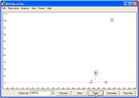
Figure 6 Position of curve index points used to analyse sample genotype.
These are local minima and maxima, and the points of intersection with the horizontal
red line. The red ellipses show the clusters of points that correspond to wildtype genotypes.
Data analysis
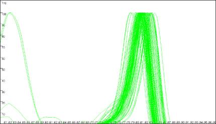
Melting curve analysis
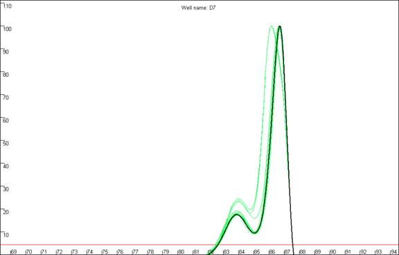
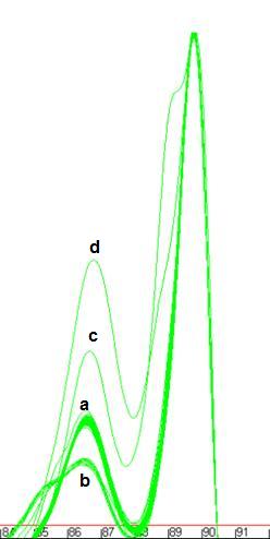
The program is designed to analyse melting curves that contain up to three distinct peaks
(Figure 7). If two domains have very similar melting temperatures (Tm) then
the
Figure 7: Melting curve data showing DNA fragments with 1 (a), 2 (b, c) and 3 (d)
different DNA melting domains.
peaks will merge to create a peak with a shoulder (Figure 7b). The position of such a
shoulder tends to be very sensitive to intra-assay variation, and so is not used for the data
analysis. However other points on the melting curve may be much less affected by such variability,
so that analysis of these complex curves is usually still possible.
Figures 7a
and 7b also show individual curves that contain small extra peaks (at
68.5ºC in Figure 7a and 81ºC in Figure 7b). These aberrant
peaks generally result either from the presence of an extra spurious
amplification product or from general background “noise” in faint samples.
Generally speaking, curves that contain these secondary peaks produce
unreliable results. Another problem arises if an individual reaction happens to
contain a strong primer dimer product but little or no target DNA product; in
this case, the primer dimer peak will be set to 100 units. Its exact location
will be sequence-dependent, but it will be placed well to the left of the other
samples.
In the Raw data view, the program will display all
curves, but in the Normalise and
Peaks views it ignores very faint samples. However, samples do occur that could be
correctly scored if these aberrant features were disregarded; this can be done
by manually setting the cut-off parameters.
Setting cut off parameters
Cut-off values are specific to each data set, and are therefore entered using the
Plate setup window. These values
are saved to disc together with the Plate setup data, and so can be used to analysis
subsequent LightScanner runs. To demonstrate the effect of the cut-off parameters, Figures
8 and 9 show curve data from a file that includes samples with
aberrant peaks. (It should be noted that these samples exhibit a large
intra-assay variation with respect to temperature, and so are not reliable.) Figure
8b shows two curves with major peaks at approximately 52.5ºC and three
other curves with minor peaks below 20 dF/dT units. When these curves are
displayed in the Normalise view,
the two erroneous major peaks are shifted to the right and it is apparent that
a significant proportion of the denaturing information has been lost (Figure
8c). In the Peaks view
the program has detected the maximum peak points for these two curves as well as extra
data points for the curves with the minor peaks (Figure 8d).
a.
b.
c.
d.
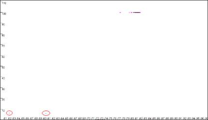
Figure 8: Analyses of melting data with no cut-off values set. a shows
the Data sets panel from the Plate setup
window. The minimum temperature (x axis) cut-off parameter is set by entering a value
between 50 and 100 in the Ignore melting data below this temperature
box. The dF/dT (y axis) cut-off is entered in the box labelledCut off
point for troughs. b, c and d show the resultant graphical
displays for Raw data, Normalise
and Peaks view respectively.
Figure 9
shows the same data analysed in Figure 8, but with the cut-off values
set to 70ºC and 20 dF/dT units. To identify the cut-off values, red lines are
drawn across the graph at the appropriate values (Figure 9a compared to Figure
8a). Since the two erroneous major peaks are below the 70ºC cut-off value,
they are ignored in the Normalise
and Peaks modes.
Similarly, since the minor peaks are below both the 70ºC and 20 dF/dT units
cut-offs, these spurious data points are disregarded too. As stated earlier,
these cut-off parameters can be saved with the plate set-up data. However,
since
a.
b.
c.
d.
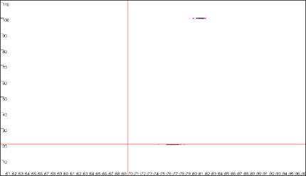
Figure 9: Analyses of melting data with cut-off values set to 70ºC and 20 dF/dT units.
a. shows the Data sets panel from the
Plate setup window as seen in Figure 8a; the values are
set to 70ºC and 20 dF/dT units. b., c. and d. show the resultant
graphics for Raw data, Normalise and
Peaks views respectively.
the degree of displacement of curves along the temperature axis can vary between runs, these
cut off points should not be placed too close to the features to be analysed.
Cut-off parameter considerations
Temperature cut-off
The program
analyses a run by starting with the first reading (i.e. lowest
temperature) and identifying the first peak maximum. From this point, it scans
backwards to find the point at which the dF/dT value falls below the set
cut-off (or 0) value. During this phase, the temperature cut-off is ignored for
these troughs and only the dF/dT cut-off is considered. This is because of the
way in which the the LightScanner collects data, and to avoid occasions where
some samples meet the temperature cut-off before the dF/dT cut-off while others
do not. (In the latter case, this would produce an abnormal data point
distribution, which it would not be possible to analyse with any confidence.)
dF/dT cut-off
To optimize the
determination of data points, it is important that the dF/dT cut-off is chosen
to be well clear of (either above or below) any cluster of data points (at
least of those that represent the wild-type genotypes, and if possible, of the
outlying samples too). For example, Figure 10 shows the effect of
repositioning the dF/dT cut-off relative to a trough. If none of the wild-type
curves is intersected by the cut-off (a-b) the distribution of
points is a result of both the temperature and dF/dT values, allowing both
variables to influence the final analysis. In contrast, if most of the curves
are intersected by the cut-off line (e-f) only the temperature
value varies between different DNAs’ melting profile, with poor discrimination
as a result. If only a proportion of the curves are intersected by the cut-off
line (c‑d) some data points are well resolved, as in a-b,
while others are not, as in c-d. These effects reduce the
accuracy of the analysis and increase the likelihood of genotype calling
errors. It must also be appreciated that if the trough is bisected by the
temperature axis, a similar effect will be seen. If the
cut-off value cannot be placed below the trough, or it lies at dF/dT=0, then it
is better to place the cut-off value above the cluster of minimum points.
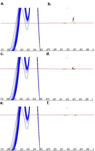
Figure 10: The effect of changing dF/dT cut-off values on the
positions of data points used for mutation analysis. Figures 10a, c
and e show the curve profile while b, d and f show
the resulting data points for cut-off values of 28 units (a and b),
32 units (c and d) and 36 units (e and f).
Curve viewing options
As stated earlier, curves can be viewed as data analysis
points (Peaks
view), normalised data (Normalise
view) or raw data (Raw data
view). These views are accessed by either pressing the left or right mouse
buttons or through the three buttons at the bottom right of the program
interface. When using the mouse buttons the focus will move to the appropriate
button. These views can be modified via the View
menu and the remaining buttons at the bottom of the user interface. The Scale function button was
described earlier and affects all the views. The Cycle function highlights each curve in turn,
while displaying that curve’s well address in the centre top position of the
graph area (Figure 11). (This function is only available in the Normalise and Peaks views; if it is
selected while in Raw data
view, the display is converted to Normalise.)
Each curve can be highlighted in turn by pressing the Next or Previous buttons while in Manual mode (View > Cycle > Manual)
or automatically by selecting Automatic
from the Cycle
submenu. When using the Automatic
feature the user is prompted to enter a time interval after which the next
curve is highlighted. Only the curves belonging to the current set are
highlighted, and they are displayed in the same order as they were entered in
the Plate setup
window. Clicking the Reset
option of the Cycle
menu will set the current curve to the first curve of the set
a.
b.
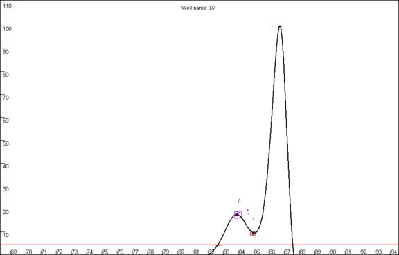
Figure 11: Highlighted curves in the Normalise
view (a) and Peaks view (a). The well address
of the highlighted curve is displayed in the top centre of the graph area.
In the Peaks view, only data
points at the curves’ local maxima and minima are normally shown. However,
selecting the
option marks an inflection point in the curve by a cross (Figure 12).
These shoulders typically demonstrate a high degree of inter-assay variation,
and so are not used in the program’s mutation-screening algorithm; however;
they can be used to manually create subsets. Therefore, activating this feature
enables two options in the submenu;
these options will be discussed later.
Figure 12: The option
indicates the positions of inflections in the curves which do not generate either
a peak or a trough. a. shows the curve data in the
Normalise view while b. and c. show the same data in the
Peaks view with (c) and without (b)
the Show shoulders option activated.
It must be noted that situations
will arise in which curves have identical genotypes, but due to intra-assay
variation some are ascribed a peak/trough while others are marked as a
shoulder; similarly some may be given a shoulder and others nothing. In the
former case, these DNA fragments will not be suitable for analysis by the
present method.
Curve analysis options
Sample genotypes can be determined either by eye or
automatically. To illustrate these two methods, the data shown in Figure 13
will be used in the following sections.
It can be seen that this set of samples contains four
easily identifiable genotypes, one of which contains a prominent shoulder;
these will be referred to as a13, b13, c13 and d13. As stated above, shoulders
tend to be very variable, and care must be taken when working with curves that
contain them. As an example of this, see Figure 14, in which three
replicate melting analyses of the same samples (reruns of the same microtitre
plate) are shown. It can clearly be seen that the appearance of curve c13
differs considerably between runs, especially with respect to the shoulder. In
contrast, the profiles of each curve in the sets a13 and b13 are much more
consistent across the replicate runs.
| a. |
b. |
 |
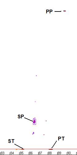 |
Figure 13: Data set used to illustra
te the and options. The four genotypes
present in this sample set are labelled (Figure 13a) wildtype – ‘a’, common mutant –‘b’, rare
mutants ‘c’ and ‘d’. The data point clusters are labelled PP – primary peak, PT
- primary trough, SP – secondary peak and ST – secondary trough.
Figure 14: Replicate melting-curve runs of one set of samples,
to illustrate inter-assay variability.
Selecting genotypes by eye
Curves can be
selected by similarity to a standard curve or by the presence of a data
point/shoulder within a user-defined cluster. These functions are activated via
the submenu of the menu. (Functions that depend on the positions of shoulders are only enabled if
the option has been selected.)
Creating sets by similarity to a selected curve.
To create a sample set containing samples with a common genotype, press the Next and Previous buttons at the
bottom of the user interface until a curve is highlighted that best represents
the genotype you wish to select (Figure 15). Then select the curve… option and enter the temperature
and dF/dT range in the input boxes. In this example, these values can be quite
wide (temperature = 0.5, dF/dT = 4), since the data points for the other
genotypes do not lie close to those of genotype a13. After the last value is
entered the Plate setup window will appear, and
those curves resembling the one selected will be moved to a new set. The set’s
name will be in the format of “Subset of ” & “current set name” &
“(n)”, where n is the number of subsets created from that set. The
highlighted curve will be used as the new set’s control, while the selected
temperature and dF/dT range will be used as the X deviation and Y deviation
values (see below of a description of these values). When the
Plate setup window is closed and the data reanalysed the selected curves
will now be shown as a new set (Figure 15)
Figure 15: The creation of a genotype set from a single curve. a.
The curve derived from well A1 was selected as the template curve.b. The curves
included in the new set are shown in the Plate setup window
(blue buttons) and the resultant sets are then displayed separately (c and d).
Creation of sets by selecting peaks, troughs and/or shoulders
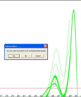
Alternatively,
genotype sets can be created by defining a region and selecting all curves that
have a data point (), shoulder
() or either one () lying within that
region. To do this, select the option from the submenu and then right click the graphic window where you want
the region to be centred on. Two input boxes will again be displayed for the
desired temperature and dF/dT ranges. A box will be drawn on the screen showing
the region you have selected (Figure 16), if this is correct click ‘Yes’
on the message box and the new subset will be created as above. The creation of
sets from shoulders or shoulders+peaks is performed in the same manner.
| a. |
a. |
 |
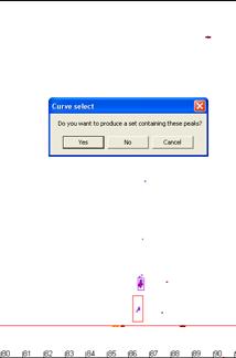 |
Figure 16: Creation of genotype sets using a user-defined area.
The red box in a andb shows the user-defined region used to form the set.
Automatic selection of genotypes
Using the menu it is possible
to automatically analyse the genotypes of either the whole plate () or the current set () and save the results to a tab-delimited
text file with a .xls extension, that can be viewed as a spreadsheet. The
genotypes are scored by similar criteria to those used in the manual selection described
above. For each set, the position of each data point cluster is found. The cluster’s size
can be either calculated by the program (see “Setting exclusion stringency”,
below) or defined by the use of control samples. Once the cluster properties
have been defined, the program analyses each curve, to determine if all of its
data points lie within the cluster boundaries. If one or more data points are
not within the cluster, that sample is determined to be non-wildtype.
Setting exclusion stringency
Figure 13b
shows the areas where the data points for the commonest genotype are clustered.
The centre point of these clusters can be defined either by the user (by adding
control samples) or by the program. If the centre points are derived from
control samples, it is possible to set the temperature and dF/dT range of the
cluster. (This is done in a similar manner to setting the size range of the
region when creating sets from peaks etc. as above.) It should be noted that
the same range is applied to all the data clusters. To set these values, open
the Plate setup window, select the Set
control check box, and enter the values in the X deviation
and Y deviation boxes.
Figure 17: The size
of the cluster is shown as a box around a group of data points and the red
circle indicates the cluster’s centre. The temperature and dF/dT stringency
values are set at a. 2 and 2, b. 3 and 3, c. 4 and 4,
d. 2 and 4.
If either of
these boxes is set to 0, then the program will calculate both ranges
automatically. The size of the cluster is set as a multiple of the samples’ MAD
value. (MAD is a statistic similar to the sample standard deviation.) A sample
is then determined to be in the expected range if it lies within a certain
number of MADs from the centre point. The number of MADs can be set via the submenu for both the temperature and dF/dT
range. In the Peaks
view, a box around the data points shows the size and position of each cluster,
while the cluster centre point is shown as a red circle (Figure 17).
Export file format
When opened as a spreadsheet, the first row contains the filenames of the data file and the
plate setup file; however, if the setup was changed or created by user input
then the phrase “User settings” is also shown. The next 10 rows contain a
summary of the results in the layout of a microtitre plate; each cell
represents a well, and if a sample is scored as indistinguishable from the
wildtype control that cell is labelled “Same”. On the other hand, if it has
been scored as different, the cell contains a number that indicates how many
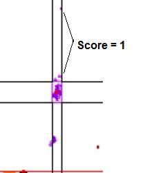
data points it failed by (see Figure 18).
The remainder of the output file is a list of the samples that were selected during the Plate setup. This list is ordered by set, with the sample order
reflecting the sequence in which the samples were added to the set. Table 2 shows part
of a typical file; cell B14
| a. |
b. |
 |
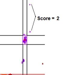 |
Figure 18: Graphic
showing the scores assigned to data points that lie outside a cluster. In a.,
the points marked by the arrows lie within the temperature range of the cluster, but
outside the dF/dT range, and so score 1. If the points fall outside both the temperature
and dF/dT ranges (b) they score 2.
shows the name of the set, while
cell A17 indicates the source of the cluster centre points; in this example it
has the value ‘median’, since no control samples were present in the plate
setup. (If control samples had been used to determine the centre point, this
cell would contain a list of the control well addresses.) The remainder of row
17 shows the cluster centre points and their ranges, in the order (primary
peak, primary trough, secondary peak, secondary trough, tertiary peak, tertiary
trough), with each cluster described in the order (temperature centre point,
temperature range, dF/dT centre point, dF/dT range). In each following row, the
values of each individual data point are then shown, in the same order as row
17. Each temperature or dF/dT value is followed by its position (“In” or “Out”)
relative to the data points cluster.
| |
A |
B |
C |
D |
E |
F |
G |
H |
I |
| 14 |
Set1 |
CDKn2a |
|
|
|
|
|
|
|
| 15 |
|
Primary peak |
|
|
|
Trough |
|
|
|
| 16 |
|
Temperature |
Range |
dF/dT |
Range |
Temperature |
Range |
dF/dT |
Range |
| 17 |
Median |
89.7449 |
+/-0.105 |
570 |
+/-0.1 |
88.6131 |
+/-0.12 |
57 |
+/-0.1 |
| 18 |
A1 |
89.78233 |
In |
570 |
In |
88.61913 |
In |
57 |
In |
| 19 |
A12 |
89.75943 |
In |
570 |
In |
87.56545 |
Out |
81.2141 |
Out |
Table 2:
Table showing part of the sample data from an exported results file. Sample A1
is the same as the wildtype curve whereas sample A12 differs from the wildtype
curve at the primary trough data point, due to a high dF/dT value. The letters
and numbers in italics represent the column and row address of the cells when
opened in Excel.
At the end of
each sample row are four columns that summarize that sample’s properties: The
first shows the Overall score of the sample; ‘Same’ indicates
that the sample genotype has been determined to be the same as wildtype;
otherwise (the sample is determined not to be wildtype) the number of aberrant
data points is stated.
The next
two columns show the sample’s fluorescence intensity, as a ratio to a
blank and in absolute terms. (If a blank was included in the set, the ratio
between the sample’s first data row value (in the .unc or .mlt file) and the
blank’s value is shown. However, if no blank was present, then the displayed
value is the ratio between the sample and the faintest sample’s value.
The final column
contains a value that indicates the quality of the curve data.
Curve Quality score
Figure 19b
highlights a curve that contains a region disconnected from the main curve
area, whereas Figure 19a shows a curve that lacks this feature. In our
experience, curves that display this feature produce less reliable results than
those that do not. In this example, the curve highlighted in Figure 19a can be
seen to lie within the envelope of all the other “a13 genotype” curves. In
contrast, the curve highlighted in Figure 19b can be seen to lie above the
other curves at the secondary peak. This sample’s curve consistently lies above
the other curves in this region, as can be seen again in Figure 14.
a
b
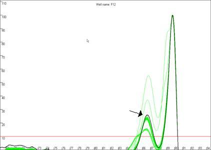
Figure 19: The quality of the curve data can be judged by the
presence of disconnected curves in the region arrowed in a. Curve F12,
highlighted in b., demonstrates this phenomenon and can be seen to lie
outside the “a13 genotype” curve set at the secondary peak (arrowed).
Fully automated analysis
Once the optimum
plate set up has been determined, it is possible to analyse multiple
LightScanner files with no user input. This is done by first creating a plate
setup file and placing it in the same folder as the data files, and then
clicking the Batch menu (Files > Batch) and selecting
the folder. The results files are named by appending the plate setup file name
to the data file name and are saved to the same folder as the input files.
With this option
it is also possible to analyse each data file with multiple plate setup files;
each plate setup file can be configured for different control samples and hence
genotypes. The program will search all subfolders and perform the analysis on
each folder. Therefore it can analyse distinct sets of data files with
different plate setup files, each set of files in a different subfolders.
Appendix
Construction of the curves used in the Raw data and
Normalise views
The DNA melting
data actually undergo a number of manipulations before being displayed as Raw data. Figure a1 shows the initial graph of fluorescence
(y axis) against temperature (x axis). (The thick blue line represents the
data from a well containing no DNA.) The fluorescence data for each temperature point is
first recalculated, as a percentage of that sample’s maximum fluorescence (Figure a2).
These data are then scaled, such that each curve has a final value of zero while
maintaining an initial value of 100 (Figure a3). These data are then
used to derive a graph that shows rate of change of fluorescence relative to
temperature (dF/dT, actually approximated by dF/dT for each time increment) plotted against
temperature (Figure a4).
The vertical
displacement of this derivative curve varies, depending on the temperature
range over which the readings are taken. To standardise this displacement, the
average gradient across the whole temperature range is subtracted from the data
(Figure a5). This is equivalent to subtracting an idealised blank from
each curve; the “experimental” blank (blue line in Figure a5) can be seen to
lie close to this zero line.
The graph in
Figure a5 shows two pronounced peaks at approximately 84.3°C and 87°C.
These peaks can be seen to match the regions in Figures a1-a3 where the
gradient of the graph is steep, representing two successive domains melting.
The present program is designed to analyse DNA products with up to three
distinct domains. If a curve contains more points it is not drawn and is
flagged as “non-wildtype”.
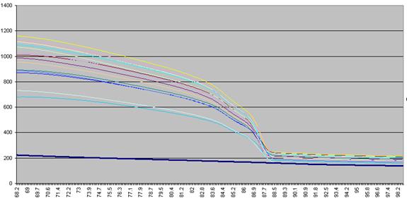
Figure a1: Raw fluorescence data from the LightScanner
containing 92 samples and 1 blank (thick blue line: no DNA).
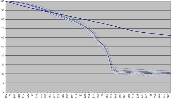
Figure a2: Fluorescence data as seen in Figure a1 shown as a
percentage of each sample’s first reading.
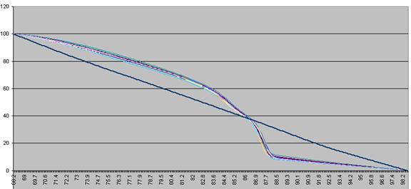
Figure a3: Fluorescence data shown in Figure 8 adjusted so
that each curve ends with a value of zero.
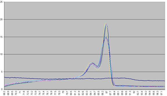
Figure a4: Graph plotting the (-) rate of change in
fluorescence (-dF/dT) against temperature.
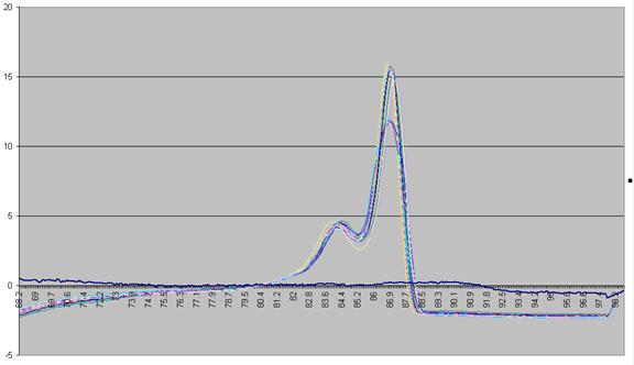
Figure a5: Graph showing -dF/dT against temperature with a
standardised cut-off.
Construction of the data points used in the Peaks view
In order to
define the data points, the program scans along the fluorescence data, looking
alternately for peaks and troughs. When it has completed this task, it returns
to the first peak, and scans backward to find the point at which the dF/dT
value increases above the cut-off value (or 0). Once a peak or trough is found,
the surrounding data points are examined to decide if the true minimum or
maximum value lies between two consecutive temperature readings; if so the
point is moved along the temperature axis to correct for the semi-quantitative
nature of the readings. If a peak and a trough are very close together (i.e.
within 3 temperature readings) the program will miss the trough and ignore
the next peak. Curves that exhibit this feature may still be correctly analysed
by eye, but should not be considered for automatic analysis.
These data points are grouped into clusters corresponding
to their positions, as shown in Figure a6. It is the position of each data
point relative to these clusters that is assessed in order to assign the
genotype of a sample. If all the data points defined for a curve lie within the
chosen statistical limits of their respective clusters, then that curve is
considered to represent a wildtype genotype. If a curve does not contain all
three clusters then the empty cluster points are ignored.
Figure a6: Naming of the peak and trough data points. (PP =
primary peak, PT = primary trough, SP = secondary peak, ST = secondary trough,
TP = tertiary peak and TT = tertiary trough)
Locating a cluster’s position and size
To permit
analysis of data points, the position of the relevant cluster must be defined.
This can either be done statistically, or by the use of known control DNA
samples. If no controls are set, all the sample data points for the cluster are
calculated and then their median value is set as the cluster’s centre
point. Alternatively, if control samples are used, then the centre point for
the cluster is set to the arithmetic mean position of the control
samples’ data points. A red circle highlights the cluster’s centre point (Figure
a7).
Once the
cluster’s centre has been defined, the spread about that point is calculated as
an average absolute deviation (AAD) value from that point. Then, a chosen
number of AADs is used to define a window, within which individual data points
must lie to be scored as normal. The number of AADs to be used for this window
depends on the intra-assay variability and the target DNA’s profile. It can be
set using the
and options
of the
submenu (or ).
The stringency can be independently set for the x and y axes.
(The actual AAD value used is derived from a second calculation, after
excluding outliers; in other words, the AAD is initially calculated from all
data points; points outside the cutoff range are then discarded and the
remaining data points used to recalculate the AAD, which is then used to assign
points as inside or outside the final cut-off window.)
If control
samples are used, then it is possible to set the distribution for the x
and y axes via the Plate
setup window. When the Set
control option is selected, the X
deviation and Y
deviation text boxes are enabled. If non-zero numbers are entered,
then these are used instead of the calculated MAD values. Unlike the MAD
values, which vary between clusters, this distribution is the same for each
cluster.
The limits of the
cluster are shown in the Peaks
view as a box around the clustered data points. Each cluster has a unique
colour that is shared between the data points, the box showing its limits and
any shoulder that may be related to the cluster (Figure a7).
Determining the genotype of a sample
Once a cluster’s
size and location are determined, it is possible to score each sample as either
wildtype or not. If a curve contains any data point which falls outside the
boundary of its correscponding cluster, that sample is scored as non-wildtype,
whereas curves that have all of their data points within the appropriate
clusters are scored as wildtype.
| a. |
b. |
 |
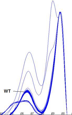 |
Figure a7: Demonstration of the program’s ability to identify
and size the clusters related to the wildtype genotype and exclude data from
non-wildtype samples.
|